What we see influences how we think and what we think influences what we do. When designing a bar or a restaurant, the thoughts, feelings, and behaviors you want your customers to have must be taken into account. What kind of ambience are you trying to create? How long do you want your customers to stay?
One of the most crucial elements in each design is the color. Colour selection in design shouldn’t be purely haphazard because the color creates an ambience, whether it is an upmarket or a fast food joint. It stimulates or suppresses a customer’s hunger, it should be a choice that is chosen after careful consideration.
The primary and secondary colors that make up the basic six-colour wheel can be split into three groups based on how stimulating each one is.
● Strong Stimulants: Yellow, Orange and Red
● Mild Stimulant: Green
● Suppressant: Purple and Blue
On a colour wheel, you can also mix primary and secondary colours to create a variety of additional complementary hues. Think about the psychology of each colour before selecting a colour palette for your bar or restaurant. The customer experience can be impacted by each of the seven colours that are most commonly used in the food and beverage business.
RED
The colour red is associated with energy, strength, vigour, power, passion, desire and love. This colour is abundant in the fast-food industry, as you may have noticed because it is so good at drawing attention and inspiring feelings of speed and efficiency.
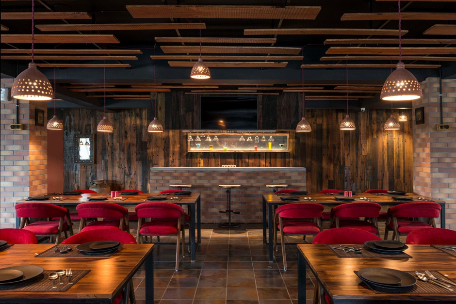
When it comes to designing with the colour red, the hue matters. Bright red stimulates conversation and raises your heart rate, while dark and dull shades elicit passion and power. Either shade, however, enhances human metabolism. Red can be an amazing choice when paired with complementary pigments.
PINK
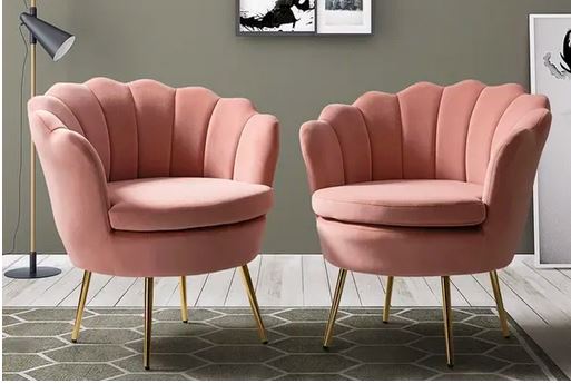
Pink is a calming and romantic colour that symbolises compassion, vulnerability, youthfulness, innocence, and gentle love. Quite often it’s used by brands targeting feminine aesthetics. But obviously, that’s not always the case. Overall, pink is a fantastic hue to utilise for a bakery or dessert business.
YELLOW & ORANGE
In terms of psychology, the hues yellow and orange represent vitality, heightened brain activity, and feelings of happiness and comfort. Similar to red, you tend to see yellow and orange used in fast food restaurants where they desire a quick customer turnaround.
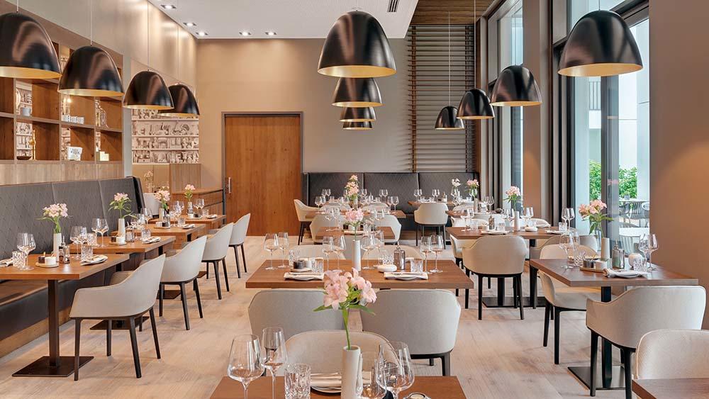
For brands/businesses that focus on organic or natural products, more neutral shades of yellow and orange, like beige, might give a natural feel.
BLUE
Blue evokes feelings of peacefulness, authenticity, and sincerity. Since blue is a suppressant, it’s best used in drinking environments vs. dining environments, as it evokes a feeling of thirst with soothing colour of nature.
However, when aiming to convey freshness in food, such as with seafood or in nautical-themed locations, blue can be used very effectively. The key is to pair the colour blue with a lot of neutrals, like brown, beige and white.
GREEN
Just a few of the qualities connected to the colour green include expansion, harmony, and freshness. It’s the hue that’s most frequently associated with tasty food! It is the colour mostly associated with either breakfast joints and vegan restaurants. Green is the colour of nature
PURPLE
The attributes of the colour purple include luxury, royalty, authority, nobility, opulence, and imagination. It is a complicated hue because it combines the stability of blue and the vigour of red.
Although purple is a suppressant, it can be used sparingly to give your restaurant an air of luxury or to send the message that your food is innovative and imaginative.
BLACK
Black is a mysterious tone that conjures up ideas of authority, elegance, and formality. A lot of black combined with little to no colour can have a very elegant appearance that exudes simplicity, sophistication and boldness.
Colour psychology isn’t as simple as it seems.
Every colour can be distinct from its original form, and these differences might change how people interpret the colour’s intended purpose. Colour mixing plays an important role, too. When using multiple colour combinations, know that some shades may resonate with their original meaning or may be altered if placed with a colour that impacts its initial profile. Also, think about the primary colour and the secondary colour while blending colours.
For instance, when blue is used with green, it might not mean that people are being encouraged for day drinking. Rather it makes the colour turquoise which symbolises calmness, friendliness, and cheerfulness, radiating the tranquility of blue and the growth of green. Turquoise can also help promote clear thinking and relaxation which you will mostly experience in hotel rooms and morning cafes.
Sometimes it can be a challenging task for the interior designer as well as the architect to fine tune the colours according to the place requirement and demands of the clients. So, thats when colour mixing becomes really important and solves all the problems.
FINAL THOUGHTS & THINGS TO KEEP IN MIND
Colour psychology isn’t always black-and-white. There are variations to the pure state of every colour—saturated, de-saturated, brightened, darkened—and such variations can affect its perceived intention. Our furniture provides the easiest solution whenever you are in doubt for your hotel, restaurant, cafe or any kind of setup. Scroll through our website or contact us to know more.


