What Standards to keep in mind when choosing furniture for your restaurant

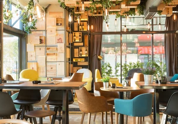
Furniture plays a significant role in enhancing the aesthetics and overall ambience of the property. Not only the furniture needs to be innovative and unique in design, but it should also be safe and comfortable for usage. At the same time, keeping the latest market trends is also necessary. But the most important of all these is quality control. The better the quality, the longer the furniture will serve your purpose.

Here are a few things you MUST do while sourcing different furniture for your hotel/restaurant!

Keep a sharp eye on furniture defects

Defected furniture can spoil your first impression and hamper the experience of your customers. To avoid that, you must always keep a sharp eye on potential defects while furniture sourcing. Conducting a furniture inspection before buying them and categorizing the potential defects can keep you sorted.For instance, if the furniture bought by the team faces any defect, the furniture provider must look into the problem as it may deter the prominence of the restaurant along with the manufacturer.

Conduct a thorough furniture inspection

Hire a team of professional furniture inspectors who can check multiple structural points and identify potential weaknesses in a set of furniture. They will inspect the furniture based on multiple parameters such as aesthetics and appearance, smell check, labeling, stability, size measurement and so on.

Evaluate and analyze

Before you get your hands on a set of furniture, conduct a root analysis so that you can identify the problem and come up with an appropriate solution.

Suppose the restaurant chairs you have ordered are not up to the mark. Now you should follow a 4-step strategy. First, address the problem, i.e. the exact defect in the chairs. Then try to identify the cause of that defect. Maybe the design or quality of raw material used is the culprit or the transportation facility wasn’t very careful. 

Then, try to determine the best solution available to you (Whether you wish to keep ordering from the same manufacturer after pointing out the mistake or seek a better option in the market.) Lastly, implement the solution that works best for you.

Furniture quality standards

You must invest in furniture that stands on par with world-class quality standards. Close inspections and lab testing are enough to ensure that your chosen furniture matches the standard quality. Check for these labels while sourcing furniture- ASTM F1561-03, EN 581-1; EN 581-3, UL962 and AFNOR NF D60-300.

Conclusion…

Furniture sourcing can be a bit strenuous, as you need to consider so many things. If you wish to make the process hassle-free and order in best quality furniture at the best prices, know that Sunny Overseas is your go-to partner. This Standards day, Sunny Overseas promises to have a perfect quality check before delivering any product to its customers.

How colour psychology impacts the selection of furniture?

What we see influences how we think and what we think influences what we do. When designing a bar or a restaurant, the thoughts, feelings, and behaviors you want your customers to have must be taken into account. What kind of ambience are you trying to create? How long do you want your customers to stay?

One of the most crucial elements in each design is the color. Colour selection in design shouldn’t be purely haphazard because the color creates an ambience, whether it is an upmarket or a fast food joint. It stimulates or suppresses a customer’s hunger, it should be a choice that is chosen after careful consideration.

The primary and secondary colors that make up the basic six-colour wheel can be split into three groups based on how stimulating each one is.

●     Strong Stimulants: Yellow, Orange and Red

●     Mild Stimulant: Green

●     Suppressant: Purple and Blue

On a colour wheel, you can also mix primary and secondary colours to create a variety of additional complementary hues. Think about the psychology of each colour before selecting a colour palette for your bar or restaurant. The customer experience can be impacted by each of the seven colours that are most commonly used in the food and beverage business.

RED

The colour red is associated with energy, strength, vigour, power, passion, desire and love. This colour is abundant in the fast-food industry, as you may have noticed because it is so good at drawing attention and inspiring feelings of speed and efficiency.

When it comes to designing with the colour red, the hue matters. Bright red stimulates conversation and raises your heart rate, while dark and dull shades elicit passion and power. Either shade, however, enhances human metabolism. Red can be an amazing choice when paired with complementary pigments.

PINK

Pink is a calming and romantic colour that symbolises compassion, vulnerability, youthfulness, innocence, and gentle love. Quite often it’s used by brands targeting feminine aesthetics. But obviously, that’s not always the case. Overall, pink is a fantastic hue to utilise for a bakery or dessert business.

YELLOW & ORANGE

In terms of psychology, the hues yellow and orange represent vitality, heightened brain activity, and feelings of happiness and comfort. Similar to red, you tend to see yellow and orange used in fast food restaurants where they desire a quick customer turnaround.

For brands/businesses that focus on organic or natural products, more neutral shades of yellow and orange, like beige, might give a natural feel.

BLUE

Blue evokes feelings of peacefulness, authenticity, and sincerity. Since blue is a suppressant, it’s best used in drinking environments vs. dining environments, as it evokes a feeling of thirst with soothing colour of nature.

However, when aiming to convey freshness in food, such as with seafood or in nautical-themed locations, blue can be used very effectively. The key is to pair the colour blue with a lot of neutrals, like brown, beige and white.

GREEN

Just a few of the qualities connected to the colour green include expansion, harmony, and freshness. It’s the hue that’s most frequently associated with tasty food! It is the colour mostly associated with either breakfast joints and vegan restaurants. Green is the colour of nature

PURPLE

The attributes of the colour purple include luxury, royalty, authority, nobility, opulence, and imagination. It is a complicated hue because it combines the stability of blue and the vigour of red.

Although purple is a suppressant, it can be used sparingly to give your restaurant an air of luxury or to send the message that your food is innovative and imaginative.

BLACK

Black is a mysterious tone that conjures up ideas of authority, elegance, and formality. A lot of black combined with little to no colour can have a very elegant appearance that exudes simplicity, sophistication and boldness.

Colour psychology isn’t as simple as it seems.

Every colour can be distinct from its original form, and these differences might change how people interpret the colour’s intended purpose. Colour mixing plays an important role, too. When using multiple colour combinations, know that some shades may resonate with their original meaning or may be altered if placed with a colour that impacts its initial profile. Also, think about the primary colour and the secondary colour while blending colours.

For instance, when blue is used with green, it might not mean that people are being encouraged for day drinking. Rather it makes the colour turquoise which symbolises calmness, friendliness, and cheerfulness, radiating the tranquility of blue and the growth of green. Turquoise can also help promote clear thinking and relaxation which you will mostly experience in hotel rooms and morning cafes.

Sometimes it can be a challenging task for the interior designer as well as the architect to fine tune the colours according to the place requirement and demands of the clients. So, thats when colour mixing becomes really important and solves all the problems.

FINAL THOUGHTS & THINGS TO KEEP IN MIND

Colour psychology isn’t always black-and-white. There are variations to the pure state of every colour—saturated, de-saturated, brightened, darkened—and such variations can affect its perceived intention. Our furniture provides the easiest solution whenever you are in doubt for your hotel, restaurant, cafe or any kind of setup. Scroll through our website or contact us to know more.